I imagine in the future there will be a different sort of archeologist. Whereas now we dig up the past’s fragile bones, unearthing Macedonian pots and splintered arrowheads, centuries from now daring scholar-adventurers will put on protective gloves and approach their keyboards. Or maybe by then voice recognition will finally function and they will simply speak into a microphone “show me the past.” (I assume by 2500 we will have gotten it right). In their holographic 3D virtual reality units, they will be sent back to a simpler time, of pixelated GIFs and glowing blue hyperlinks. Now, we find terracotta warriors, and wonder at the world that built them; our descendents will find our websites, and smile at the infantile genesis of the internet.
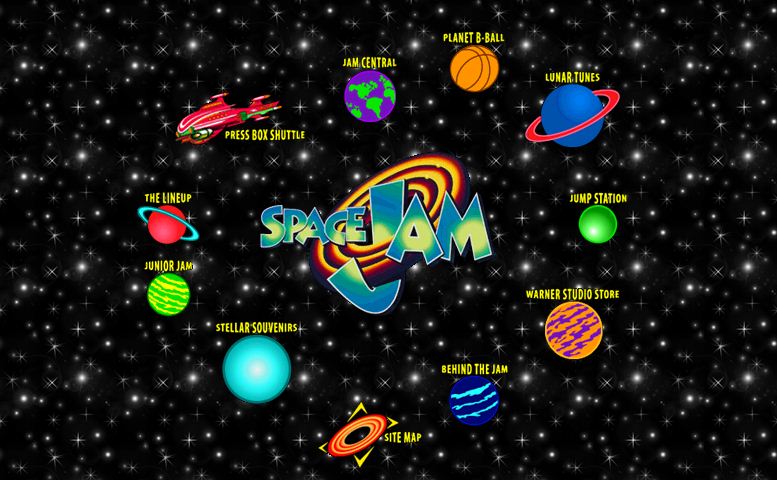
Even today, going back to the sites of the 1990s is a blast from the past. The primitive web design is frankly laughable, though it’s like unfairly comparing cave art to Rembrandt. Websites from the 90’s aren’t bad per se, they simply lack the basic modicums of user-friendliness and aesthetics that we’ve grown used to. One of the most famous of these relics is the official website for Space Jam (1996). The homepage is grainy tiled starfield, with clickable buttons beckoning you to “Jam Central,” “Planet B-Ball,” and, suspiciously, to go “Behind the Jam.” Friendly Times New Roman peeks out from every corner. Upon clicking on “Junior Jam” and heading to the welcoming “Neat Stuff to Look At!” page, you are bombarded with archaic web elements. Neon word art strobes pink against a starry green backdrop, while a flashing marquee continually reminds you that you are indeed “Junior Jamming.” Everything is evenly spaced and accompanied by descriptive text explaining the nuances of navigating this new and daunting universe. “Check out these cool pictures. Click on any of the photos to see a full-size version of the picture.” I imagine Microsoft Sam reading the instructions out loud, dispassionately leading me through the site, which has the air of a dusty children’s museum.
 The next exhibit, sifted from the sediment of eighteen years of news coverage, is the CNN OJ Simpson Trial Headquarters, still keeping watch on the trial of the (last) century. Despite the gravity of the subject matter, colorful clip art is the gateway to pages detailing the “The Trial,” “The Suspect,” “The Players,” and more. I have to wonder—did people actually take this site seriously in 1995? Was this a cutting-edge news source? How many hits did it get? Tragically, crucial artifacts have been lost, like the Quicktime animation of the crime scene, which I am certain was a true gem. The significance of this site becomes clear when you head to the “Reactions from CNN Interactive Users” page. Here the sociologist may observe the burgeoning internet anger that will later be channeled by millions of belligerent YouTube commenters; exposed to anonymity for the first time, separated from their readers by miles and miles of dial-up cables, many show the early symptoms that plague commenters of the Daily Princetonian today. One reaction reads: “The evidence weren’t there, the glove that didn’t fit for instance. And let us not forget the ridiculas job that LAPD had done on this case. Please respect the verdict and stop making this a race-issue; there is enough race-problem between people in America as it is. GOD BLESS AMERICA. — Ashes and diamonds, foe and friend, we were all equal in the end,” to which a sage responds “They don’t understand the unmeasurable depths of this INJUSTICE. this travesty of justice hurts everyone. Answer this: If he was white would the verdict be the same NO NO NO It’s not over, and never will be, thanks to their selfish, stupid, ignorance.
As culturally important as these comments are, the most fascinating excavated website of all was Dokimos.org. I beg you, dear reader, to visit this site. Stumbling across this site was like uncovering a holy ark of internet history. Dokimos is pretentious in design and message. Large dark green Arial text asks the crucial question: “What do you get for all your troubles?” The answer, emblazoned in orange against a background of repeated GIF rain: “proven character.” The character of Dokimos.org is one of religious fervency and aesthetic ineptitude. Peering into its many honeycombed pages as looped rain sounds jerkily repeated, I was afforded a window into a past where gradient rainbows and using two different fonts in one sentence were acceptable, where I was warned in a pop-up window that I was “possibly not secure in my own personal faith,” and where a small note called from the corner that the site was “best viewed with Internet Explorer, forget all the other browsers and down with the net police.” One subdivision was a fluorescent bitmap Garden of Eden, where people organized themselves into the Second Life Bible Church. Their services were on Sundays at 11:30. Maybe there still are. There was a Bible study group. Again, just in case you have forgotten, this is all happening within the online world of Second Life. Seriously, they had a pastor. Problematically, the fact that this website centers on Second Life indicates that this relic has been tampered with since it was left behind. Second Life was first launched in 2003, at which point web design had at least minimally progressed beyond the abhorrent antique forms of the 90s. In some ways, it’s like happening upon a Roman bridge spanning a river you don’t need to cross anymore, and for no discernable reason, not only using it, but retroactively add to its obscurity. Were Dokimos’ webmasters unbothered by the site’s design? Because they certainly ignored contemporary internet aesthetics when they created the Second Life Bible Church’s page.
Though I am sure that stranger things exist on the internet today, encountering such esoteric websites from the 90s made me wonder: why are these the websites that are still around? In the interest of saving space, it seems prudent to throw them onto the virtual trash heap, and release the domain from bondage. Who was the webmaster who forgot about EasyNett.com? Why has Warner Brothers left the You’ve Got Mail page up so long, serenely declaring almost twenty years later that “computers aren’t really the end of Western Civilization as we know it” as Tom Hanks and Meg Ryan, prophets of a dying land, stare on into eternity?
Imagine a museum in which all these sites are exhibits. I wonder if I have done a poor job in curating it for you. The Space Jam official website, the CNN OJ Simpson page, and Dokimos.org do not form a coherent collection, nor are they in any way a comprehensive look at the internet’s lost world. In finding each of them, though, I was enchanted by their historical specificity. Their relevance was almost entirely faded, and they carried their age like old photographs, each site betraying its own datedness through not only its content, but its coloration and quality. An editor pointed out to me that there’s an obvious reason that these sites are unchanged— they were simply never updated because they held no stake in the future. But neither do most things that are popular in any given time period. These three websites captured me in their cobwebs precisely because they were obsolete. Looking at them, I saw things that had been entirely abandoned, both technically and culturally. I laughed and puzzled and felt disquieted.
Tomorrow’s archeologist may not resemble Indiana Jones any more than those of today do. In my brief foray into the catacombs of the internet’s past, I felt less like a fedora-wearing hero and more like a creep looking at things that should no longer be seen. I doubt that the OJ Trial Headquarters site was ever meant to be around two decades later, just as the Incan vase’s maker might not have intended it to have lasting meaning. We look at the artifacts of the past and infer from them facts about the time; we see in weavings meant for warmth cultured art and we make bronze bracelets into grand statements of civilization. That web archeologist will someday discover the first websites still littered across the netscape, dig up our worst and earliest mistakes, and make guesses about us.
Inevitably, in the future, those who look back at our websites and the Space Jam homepage will see little difference. Both will seem crude and archaic. They’ll laugh at this article, laugh at the paper it’s printed on, and probably laugh at the internet too. But if these sites still exist, on that latter day, will people think this is what we cared about enough to preserve?


Leave a Reply